 because they are losing share to Apple. You could make the argument that Microsoft has a reputation which doesn’t resonate with the newer generation or that they don’t have an OS which is as easy to use and fun as iOS or that they aren’t integrating their hardware and software into a single slick package or that they don’t have retail stores.
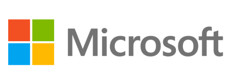
As of today however, they have altered their behavior to correct each of the above issues because after 25 years the company has a new logo.

Let’s now examine the design. Its square – you might even call it minimalistic. It even reminds you of the company’s tile-based mobile OS.
In a weird way it is a blend of the Apple and Google logo.
Jeff Hansen, General Manager, Brand Strategy, Microsoft had this to say about the new logo:
The Microsoft brand is about much more than logos or product names. We are lucky to play a role in the lives of more than a billion people every day. The ways people experience our products are our most important “brand impressions”. That’s why the new Microsoft logo takes its inspiration from our product design principles while drawing upon the heritage of our brand values, fonts and colors.
The logo has two components: the logotype and the symbol. For the logotype, we are using the Segoe font which is the same font we use in our products as well as our marketing communications. The symbol is important in a world of digital motion (as demonstrated in the video above.) The symbol’s squares of color are intended to express the company’s diverse portfolio of products.
Starting today, you’ll see the new Microsoft logo being used prominently. It will be used on Microsoft.com – the 10th most visited website in the world. It is in three of our Microsoft retail stores today (Boston, Seattle’s University Village and Bellevue, Wash.) and will shine brightly in all our stores over the next few months. It will sign off all of our television ads globally. And it will support our products across various forms of marketing. Fully implementing a change like this takes time, so there may be other instances where you will see the old logo being used for some time.
Logos and brands are very important. Many of us in tech think we are too smart to be swayed by these things but you would be very wrong if this is your thinking. I know of few people who go to the supermarket and stock up on all the generic brands – people are loyal to brands and many brands make people passionate.
Perhaps what would scare me most if I were Microsoft are the concluding comments from Hansen:
We’re excited about the new logo, but more importantly about this new era in which we’re reimagining how our products can help people and businesses throughout the world realize their full potential.
He is absolutely right about this statement – this is what Microsoft does. It allows me to work more efficiently and the Xbox allows me to play more effectively. But this statement translates into “Making you more efficient” which roughly translates into “boring.”
On the consumer side of things, Apple and even Google are becoming synonymous with exciting.
Microsoft’s biggest challenge is how to excite customers in this new age of consumerization of IT while keeping its image as a rock-steady tech company with reliable and secure offerings.
These are two different identities. If Microsoft were a man, it would need to wear shorts, a T-shirt and a tuxedo or suit jacket.
And let’s hope for the sake of Redmond, this branding move by the company is a step in that direction. If not, we may see a day in the future where HP and Dell seem a lot like Nokia and RIM.


