 So I'm just minding my own business, surfing my own blog yesterday when I noticed I received some Google click-throughs (referrals) directly to a blog post I just wrote yesterday, ironically about Google that apparently was picked up by Google just hours after I posted it. I was curious how the heck Google was picking up my blog post titled "New Google Adsense Graphical Ads" so quickly, so naturally I Googled "new google adsense graphical ads" the blog title - nothing. Hmmm, that's odd. Why is Google giving me referral links directly to such a new blog post? So then I added "keating", as seen by this Google Search to try and narrow down the search results:
google.com/search?l=new+google+adsense+graphical+ads+keating
and see if Google had indeed cached my site and new blog post yet. I scroll down and still see nothing in the Google search results. However, as is common the case, I got sidetracked and lead off into a tangent by something else while scanning the Google search results. In fact, the very LAST search result caught my eye (Google search results partial screenshot below), just as I was about to hit Ctrl-W to close the Firefox tab. Just think, if my eye had been a bit slow in scanning or my Ctrl-W trigger fingers had been slightly quicker this blog post would have never have happened. :) 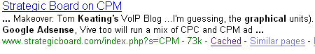
Curious, I decided to click-through to find a search engine called Strategic Board displaying a search of the key term "CPM". I didn't see my blog or name listed after scrolling about 3/4s down. I was about to close this Firefox tab as well, when I saw my name and blog listed, as seen by this screenshot: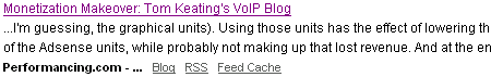
My eyes light up. Performancing.com mentioning my VoIP & Gadget blog? Hey, I know these guys! I've come across their site quite a few times - they're the developers of the new and increasingly popular Firefox Performancing plugin - a WYSIWYG editor for publishing directly to Blogger, Wordpress, and Movable Type blogs. Heck, I just installed the Performancing for Firefox plugin about two weeks ago to try it out.
I've only been testing it with one of my test blogs and it works pretty well, but I already installed the WYSIWYG HTMLArea directly onto my Movable Type server, so I already had a graphical editor I've been using for years. HTMLArea features other stuff like spell-check, ability to enter in ping URLs manually, and a few other formatting buttons. Since HTMLArea is no longer supported I've also considered switching over to the open-source FCK graphical editor. Still, I like the Performancing Firefox plugin enough to play around with it some more once I have more time.
So anyway, I guess I got off on a tangent here. I did mention I do that sometimes, didn't I? ;) So I click-through to the Performancing.com blog and see that they are doing an "Extreme Blog Makeover" - and guess who's the lucky blogger getting the makeover? Yep, you guessed it - me. I feel so honored. ;)
In Andy Hagan's blog post titled, "Monetization Makeover: Tom Keating's VoIP Blog", Andy critiques everything from my blog's advertising placement (Google Adsense, Chitika, Telebay, etc.), to advertising network selections (thumb down to Chitika and thumbs up to Adsense), to the choice of which Adsense layout to use (he likes the wide 160 pixel Adsense ad over the 120 pixel version) to which color-scheme I should use for my ads. Heck, he even includes a screenshot of what my blog looks like "before" and a Photoshopped screenshot of my blog "after" he incorporates his suggested makeover tweaks.
Here's a slighly scaled down version of the before/after "Extreme Blog Makeover" Andy did to my blog. Note the "What Would Andy Hagan" Do: :D ![]()
Andy writes:
Welcome to the second edition of Monetization Makeover. In this series, I review the monetization of different blogs, in terms of both strategy and ad placement, and make suggestions for improving profits.
Today’s lucky blog: Tom Keating’s VoIP and Gadget Blog. Optimized correctly, a blog like this can make bank...
Tom Keating's VoIP and Gadget Blog is a very well read site in its area. The niche he's in is one that pays very well with contextual advertising, since CPC bid prices for VoIP-related keywords are very high (trust me, I know). With this in mind, let’s analyze a "permalink" page. As a long-established blog with gobs of content, Tom Keating's blog receives tons of traffic from search engines like Google.
Well Andy, thanks for the kudos, but you may not want to fill my ego any more -- it's big enough already. Least that's what my wife tells me. ;).
I figured I may as well critique Andy's "critiques". It's only fair.
>>Make the skyscraper part of a left column - Skyscrapers nearly always perform significantly better on the left.
Very true and I agree 100%. People read left-to-right, top-to-bottom so the top left corner attracts the most eyeballs. So you are right, but hey, my major blog redesign back in September 2005 could have worse - you could still be looking at this old VoIP & Gadgets blog layout or even this ugly layout from 2004 ;) I've actually been considering moving Adsense to the left nav bar for quite some time due to the higher click-through rate. It's on the To-Do list.
>>Change the sky to 160 width (it was 120 before) - 160 sky’s perform a lot better than 120 sky’s. The human eye can read the wider text much more easily (and thus click more often).
Ya know, I read that somewhere too, but heard other so-called Adsense experts saying just the opposite - that 120 pixels was better. I'll give it a shot and see how it goes.
>>Blend the skyscraper - The default Adsense color pattern (white background, blue border) performs terribly. Blending = good.
Blending is indeed a good idea - it does indeed make it harder to spot that they are advertisements. The main reason I hadn't changed the color scheme was because like you sted in your post, I have 6 ad units and I figured I'd sacrifice some click-throughs for the sake of being "honest" about where the Adsense ads are located. Having such a large number of ad units and hiding/blending the Adsense ads just seemed a bit disingenuous to me. Or at least a blog advertising whore with only the almighty dollar in mind. I suppose if I drop the Chitika ads (another one of your suggestions) I might be willing to blend the Adsense ads
>>Put the graphical skyscraper below the Adsense skyscraper - This one comes with a caveat as I’m not sure what kind of deal, CPC or CPM they get from these. But chances are, they pay a lot less than Adsense for a topic like VoIP. So feature the Adsense.
An obvious choice, but alas my company, TMC sponsors that graphical skyscraper, so it has to stay. I originally had Adsense above the graphical skyscraper, but TMC's marketing department overruled me here. But hey, if the TMC house ad helps drive people to Internet Telephony Conference & Expo which builds up TMC's overall revenue, eventually the "trickle down economics" will reach me via a pay raise reward, so it's all good.
>>Drop Chitika - For a theme like VoIP, Adsense is going to wildly outperform a program like Chitika (again, I know from experience)
You're a mind reader. I was thinking of pulling them this week. Ironicaly, I was asked by the owner of the popular Vonage Forum how I like Chitika since he was considering adding Chitika ads. My advice to him was that not enough relevant ads would display for his VoIP site. My site gets "some" relevant Chitika ads since I don't exclusively write about VoIP - I also write about and review consumer gadgets, but even then the Chitika ads only get around a paltry 0.30% CTR (click-through rate).
>>*Not pictured* Change Adsense title text to a more clickable color - To get that ridiculously high CTR on Adsense units, all you have to do sometimes is use red, orange or a shade of blue as the title text. Experiment a bit, as this will vary from blog to blog, but it can make a pretty big difference. (I didn’t picture this one however since I thought it might detract from the design--everything is a tradeoff.)
Agreed. I need to mess around with Google Adsense colors more.
Overall, I like your suggestions, and I think I'll incorporate some of them. In fact, a few of your suggestions were going to be incorporated by a Javascript stylesheet switcher that I've been working on. It lets the visitor switch the layout of my blog on the fly to one of their liking. I'll make the default style have the Adsense ads on the left as you suggested.
I'm still trying to get over how I was three links removed from Performancing.com's blog post and still somehow found it, but I'm happy to have experienced my first Extreme Blog Makeover! :D